Product people often say: "This flow is pretty simple."
And from inside the company, it probably is.
The PM knows the logic. Design knows why the button is there. Support has seen the same question 200 times. CS knows the workaround. Engineering knows the edge cases. Everyone inside the company has context.
The user does not.
They arrive with their own role, their own level of experience, their own company process, their own pressure, and their own reason for being in the product right now. They are not seeing the product through the lens of roadmap discussions, design reviews, support history, or onboarding playbooks. They are just trying to get something done.
That is where product teams often fall into a trap.
What feels obvious internally is not always obvious externally.
"Simple" depends on who is looking
A product flow can be clean and still confuse people. A button can be visible and still fail to explain the next step. A setting can be documented and still feel risky to change. A workflow can make perfect sense to a power user and still feel unclear to someone new.
This does not mean the product is bad. It means different users bring different levels of context into the product.
Some users know the domain well. Others are new to the category. Some are admins. Some are occasional users. Some are technical. Some are not. Some have used similar tools before. Others are trying to complete the task for the first time while under pressure from a manager, a customer, or an internal team.
When product teams say "it is obvious," they often mean: "it is obvious to us."
That is a very different thing.
Help usually arrives outside the workflow
When users get stuck, most companies move the help outside the product.
The user can open a support ticket. They can ask their CSM. They can book an onboarding call. They can search the help center. They can watch a tutorial. They can ask someone internally. They can talk to a chatbot.
All of these can help. But they are still workarounds for the same core problem: the user needed help inside the product, while they were trying to complete the workflow.
Instead, the help arrives later, somewhere else, through another channel, often with missing context.
That gap creates friction. It slows onboarding. It creates support load. It makes adoption harder. It turns small moments of confusion into tickets, calls, follow-ups, and sometimes quiet abandonment.
The hardest part is that many of these moments are invisible. Users do not always complain. They do not always open a ticket. They do not always tell the CSM they are confused.
Sometimes they just stop.
Chatbots help, but they are not enough
Chatbots are useful. They can answer questions, reduce some support volume, make documentation easier to access, and help users find information faster.
But a chatbot is still usually waiting for the user to do the work of asking the right question.
That sounds simple until you look at what the user actually has to do.
They need to understand what they are stuck on. They need to phrase the question correctly. They need to understand the answer. Then they need to translate that answer into the right action inside the UI.
If they are already confused, that is a lot to ask.
A chatbot can say: "Go to Settings, then Integrations, then select the CRM connection."
But the user may still wonder: Which settings page? Do I have permission? Is this safe to change? Which CRM connection? What happens after I click? Why am I doing this in the first place? Is this even the right step for my use case?
The issue is not only access to information.
The issue is guidance in context.
Product teams need to think beyond cleaner UI
Cleaner UI matters. Better copy matters. Better onboarding matters. Better documentation matters.
But none of them fully solve the problem, because products are used by different people in different contexts, with different goals, permissions, habits, and levels of confidence.
A clean UI can reduce friction, but it cannot predict every moment of confusion. An onboarding session can explain the basics, but it cannot cover every future workflow. A help center can document the product, but it does not appear at the exact moment the user hesitates. A generic product tour can introduce the interface, but it rarely adapts to the user's actual intent.
This is where product teams need to ask a different question.
Instead of only asking, "How do we make the UI cleaner?", they should also ask, "How do we help different users succeed when the UI is not enough?"
That question matters because the product experience does not end when the screen is designed. It continues when real users try to get real work done.
That is where confusion appears. That is where adoption breaks. That is where support tickets begin. That is where users either build confidence or lose momentum.
The missing layer is in-product guidance
A lot of product friction is small.
A user pauses because they are unsure what a field means. Someone skips a setup step because they do not understand why it matters. An admin avoids a configuration because it feels risky. A new user clicks around for a few minutes, then gives up. A team never discovers the feature that would have made the product much more valuable.
From the company's side, these moments may later appear as low usage, failed onboarding, poor activation, support tickets, or churn risk.
From the user's side, it was much simpler:
"I did not know what to do next."
This is why product teams need an in-product layer that can help users in the moment. A layer that understands where the user is, what they are trying to do, what role they have, what they have already completed, where they may be stuck, and what the right next step should be.
Then it should help them move forward inside the workflow itself.
Before they open a ticket. Before they book a call. Before they abandon the task. Before Product sees the drop-off in a dashboard two weeks later.
Product friction becomes company friction
When users get stuck, the cost does not stay inside the product team.
Support pays for it through repetitive tickets. CS pays for it through extra calls and follow-ups. Sales pays for it when expansion becomes harder. Product pays for it through poor adoption and unclear feedback. The customer pays for it through wasted time and frustration.
That is why "the UI is simple enough" is not a safe assumption.
It may be simple for some users. It may be simple for internal teams. It may be simple for people who already understand the product category.
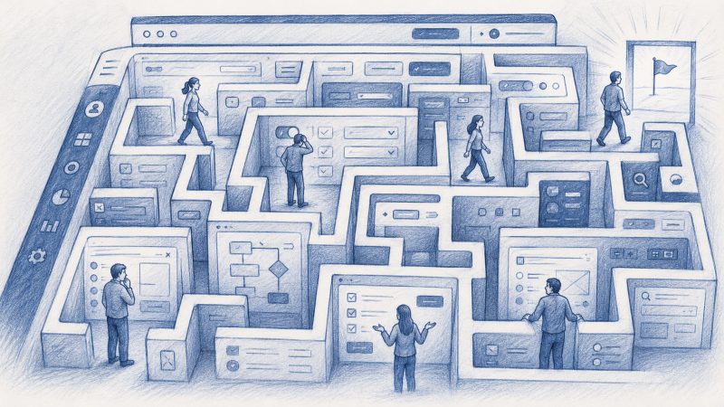
But the real test is whether different users can reach value without being left alone inside the maze.
The product should help users move forward
Good product experience should not mean:
"Here is the UI. Good luck."
It should mean:
"We understand where you are, what you are trying to do, and how to help you get there."
That does not replace good product design. It raises the bar for it.
Modern products are getting more powerful, not less. Workflows are getting more complex. Users are more diverse. Teams expect faster onboarding, stronger adoption, and more self-service.
So the answer cannot be to keep pushing users out of the product every time they need help.
More of that help needs to live inside the product itself.
Where the user is.
Where the workflow is happening.
Where the confusion starts.
And where the next step can still be taken.